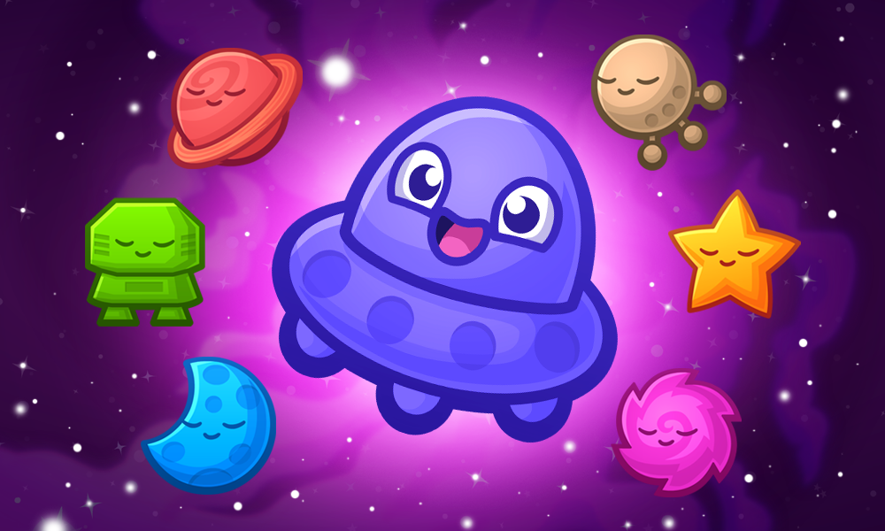
Designing a set of Stars for the Matchyverse™ required so many iterations I’ve lost track. We needed memorable shapes that stood out — distinct at a glance — and eventually they grew into full personalities.
We started with nothing and somehow ended up with a universe. Early on, we just called them “gems” or “shapes.” It took months before we realized they were Stars — and the Matchyverse™ was born.
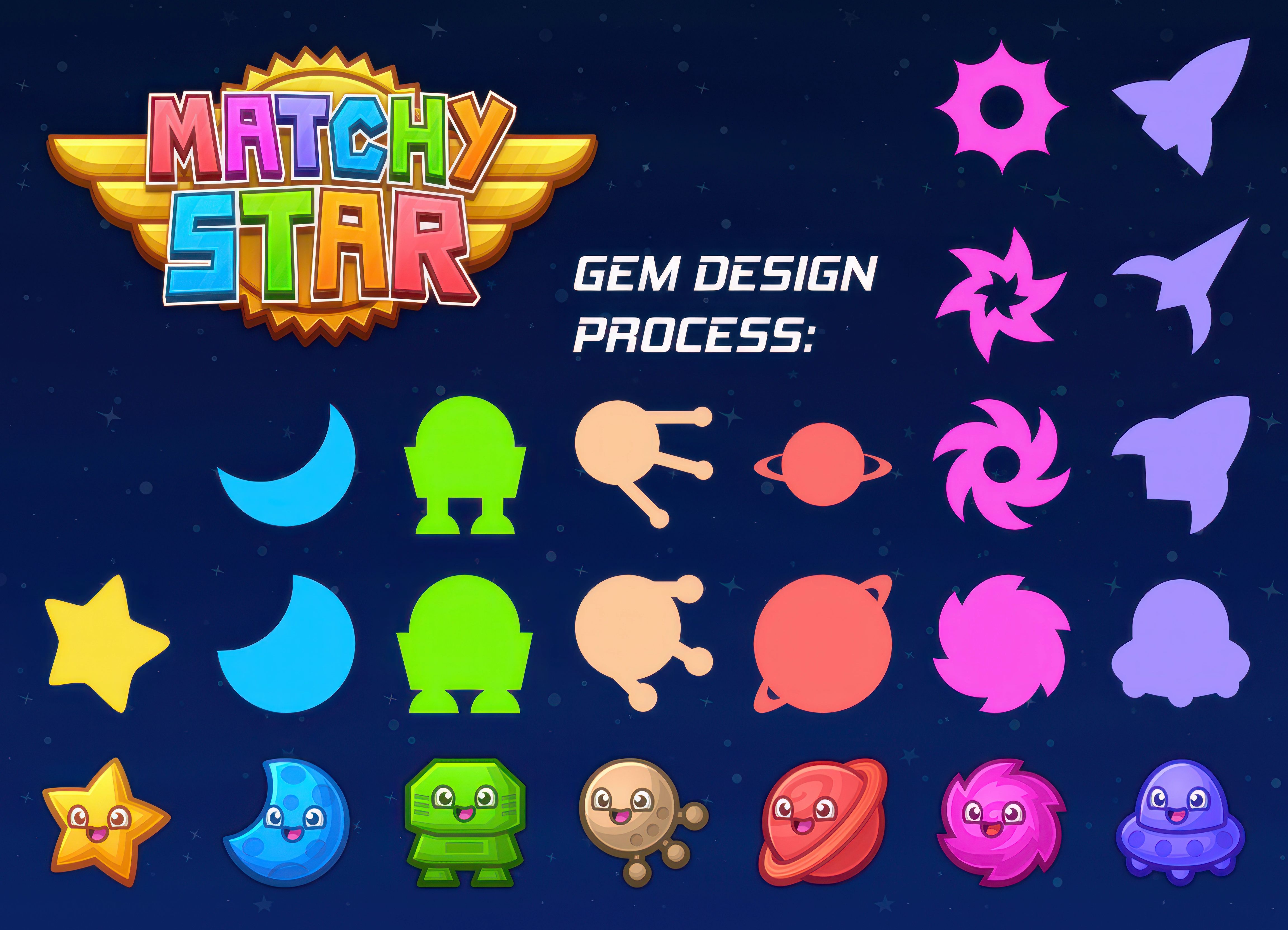
Getting the final shapes for the Matchy Star™ Stars took a lot of design work. Matchy was the easiest, but we needed a full set of seven — which meant clean color + shape differentiation so players could instantly tell who was who.
For the colors, we started from the palette of Don’t Shoot Yourself™: bright and vibrant, but designed so the colors wouldn’t clash or compete.

The first step was figuring out a set of spacey shapes that fit the theme and were visually distinct. After Matchy, a crescent moon was an obvious choice. “Blue Moon” must’ve been floating around in my subconscious, so the Moon became blue.
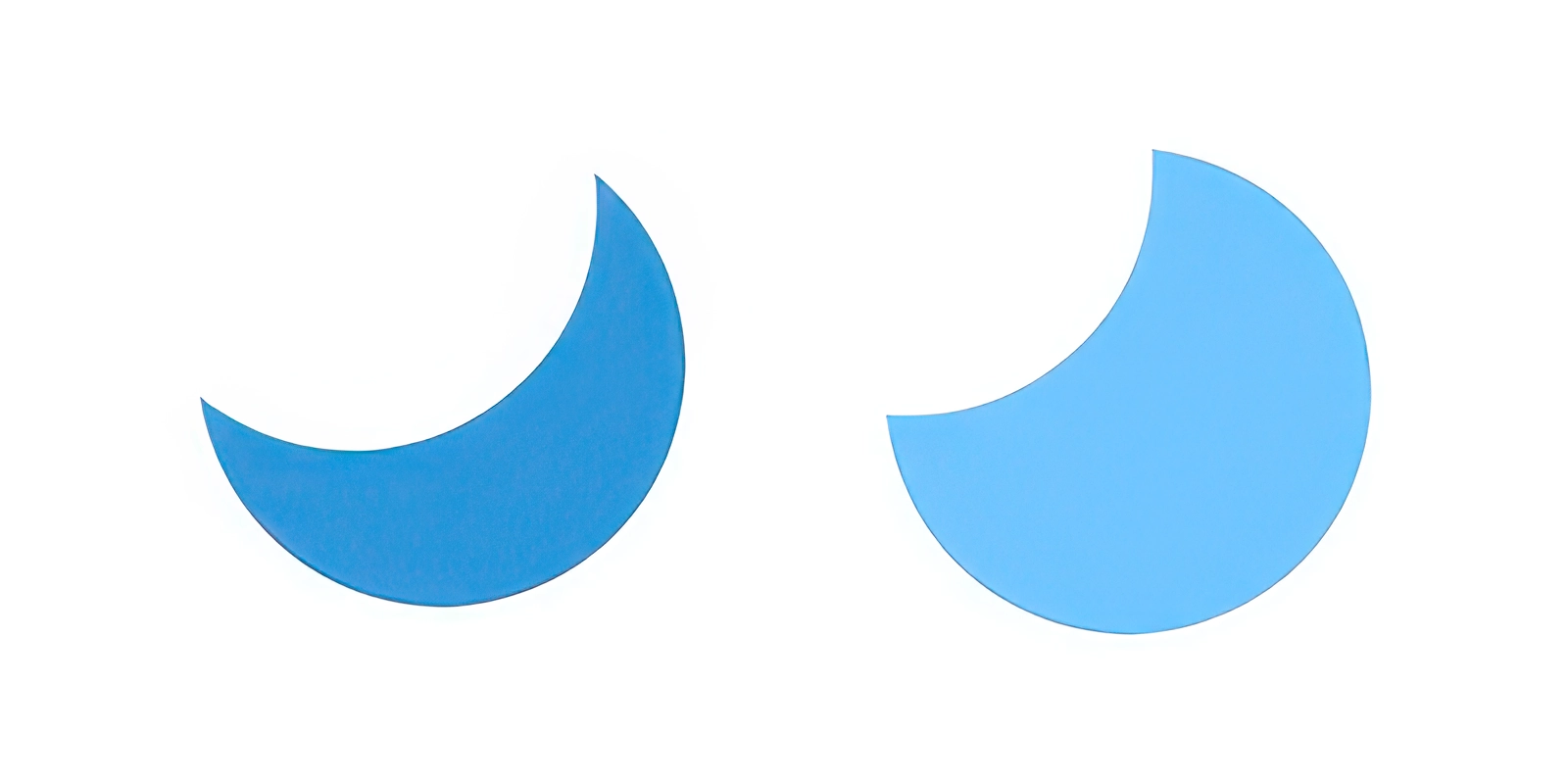
The Moon took two iterations. The first was too thin — my mom said it should be beefier to be cuter — and she was right.
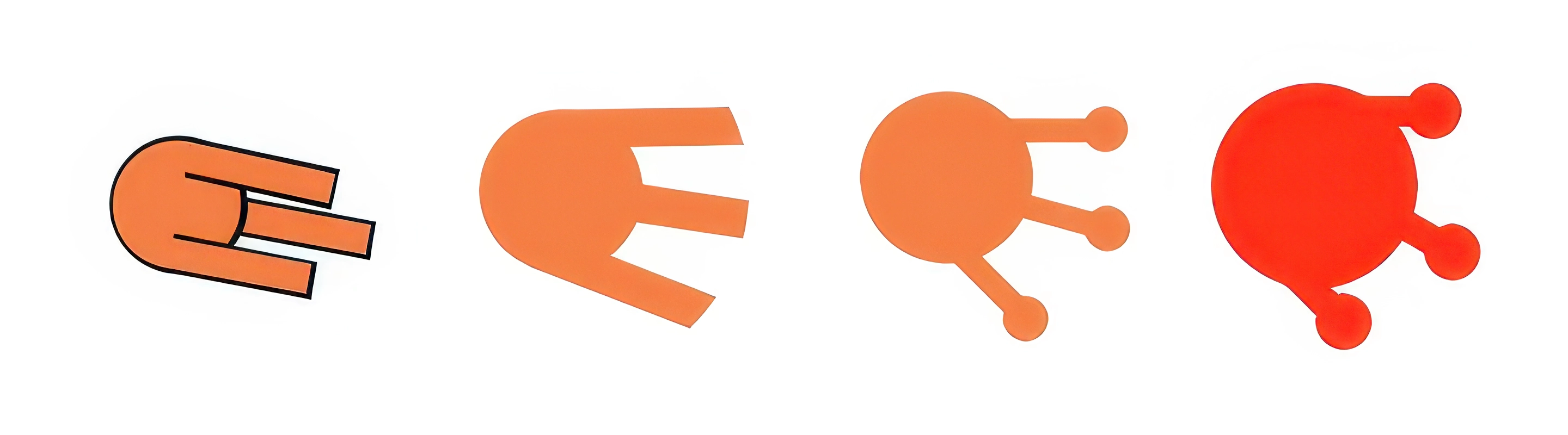
Next I wanted a space satellite. It started orange, took a lot of simplifications, and became a red Sputnik. I already had a Sputnik character in Speedway Heroes™, so the iconic lil’ spud was already living rent-free in my brain.
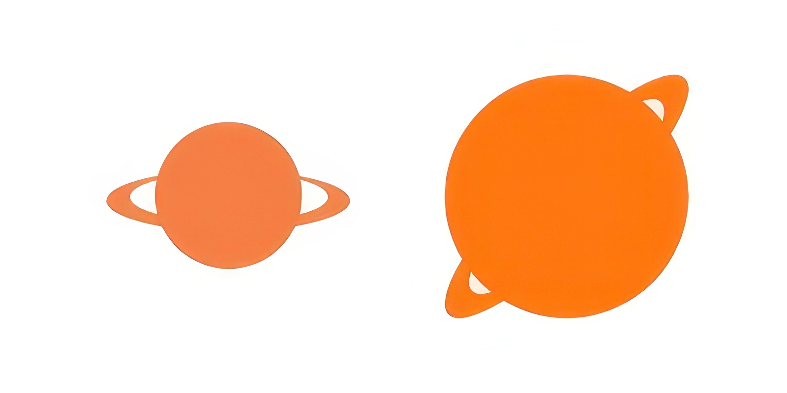
Once Sputnik was red, I made a ringed planet orange. Rotating it 45 degrees made it feel bigger without taking more texture space:
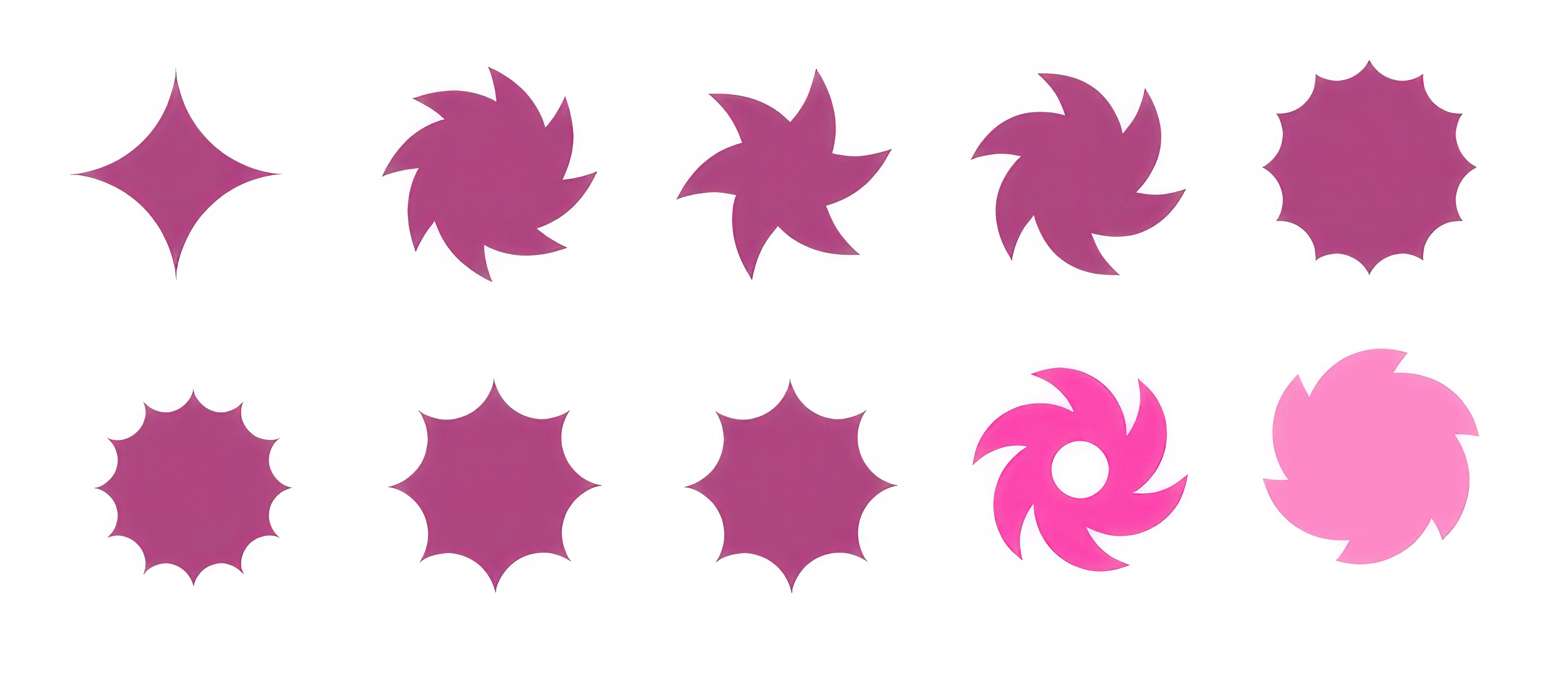
Next came a galaxy shape — spokes and points so it wouldn’t blend into the rest. The number of spokes and curves took a lot of fidgeting. Some versions looked like saw blades. Others looked like gears.
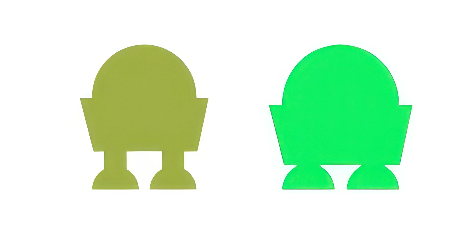
I knew we needed a robot. I assumed it would be green (Android logo brain), but we compacted it and shifted the concept into a “Lander” so it wouldn’t read as Android-adjacent.
The last Star was the most complicated. It was originally meant to be a spaceship before the idea solidified: ships travel above the grid, and Stars live on the grid.
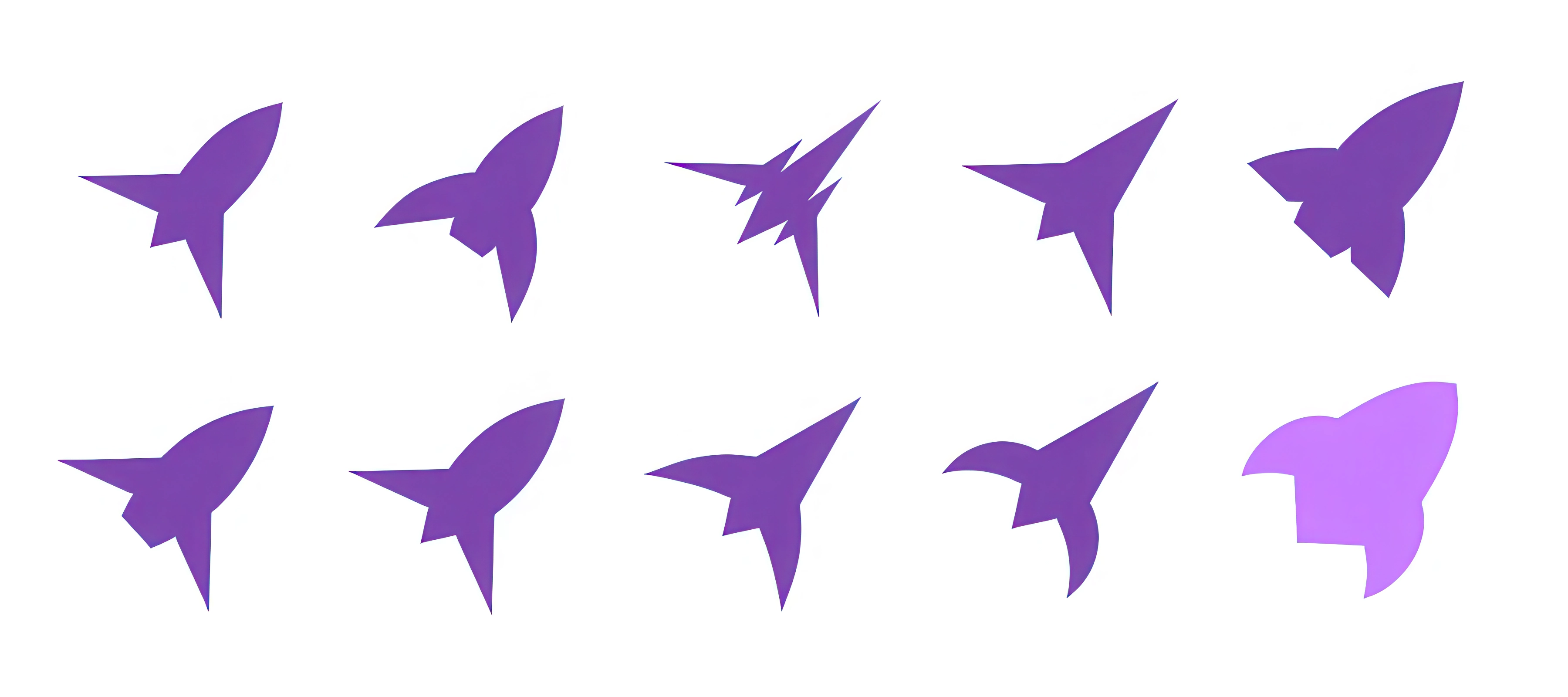
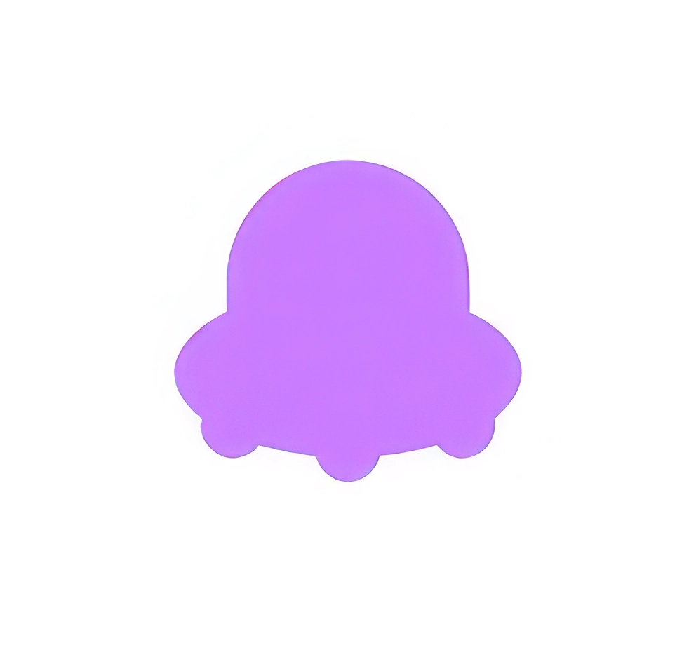
We also had a UFO concept intended to sow chaos. Eventually, the ship and UFO swapped roles — the ship became the collector above the grid, and the UFO became one of the Stars. You can tell the ship’s direction by its shape, which matters for planning moves.
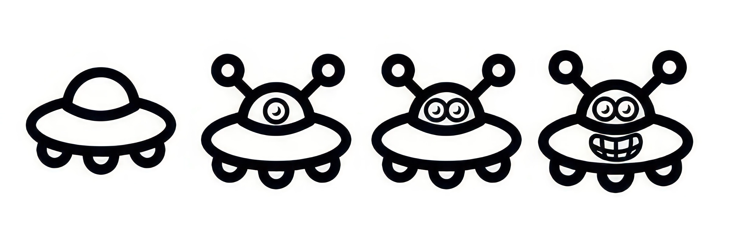
Thus we got the final Star: a UFO.
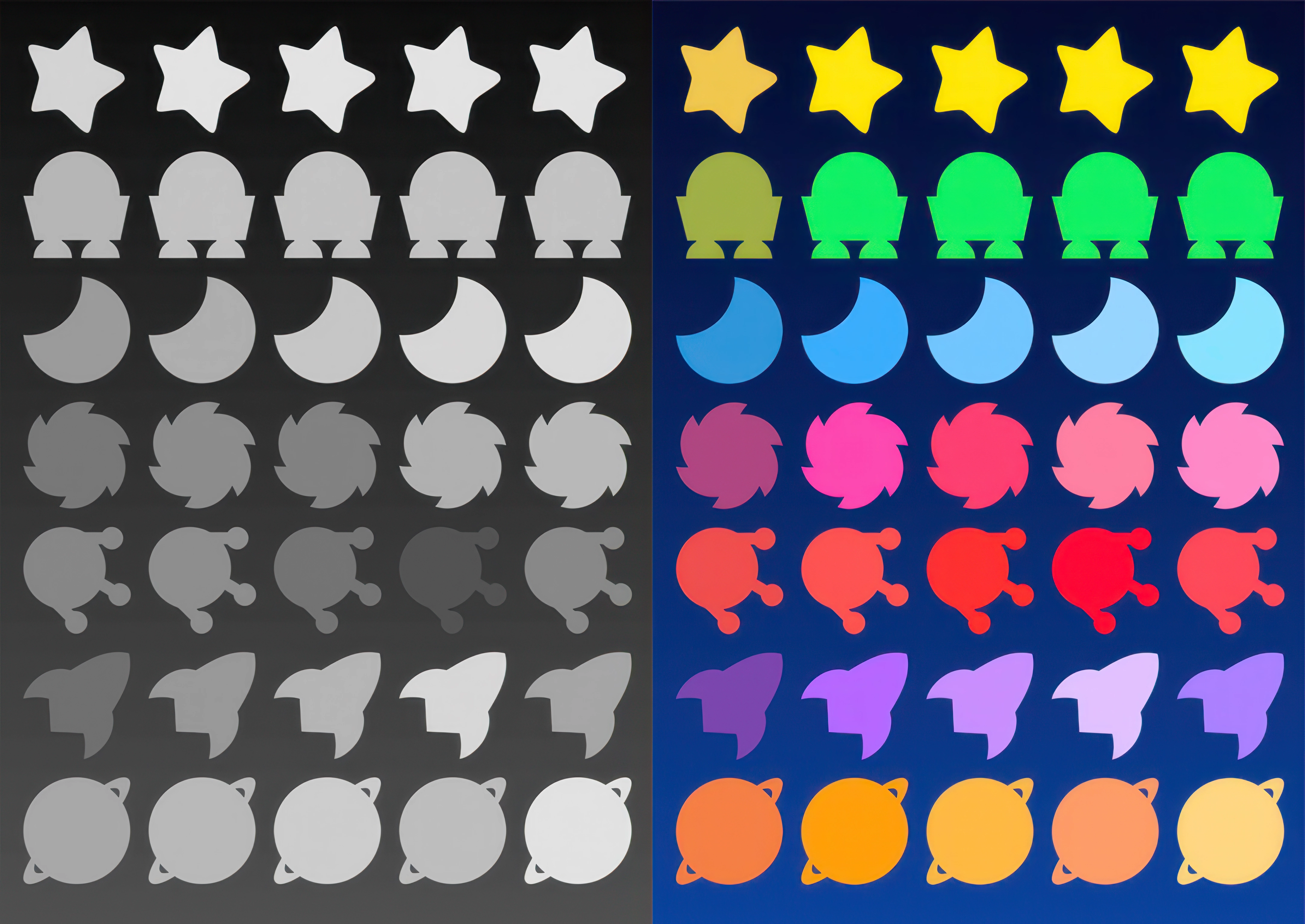
Even after the shapes were right, we did more passes on color balance so each Star stood out. We even converted screenshots to black and white to compare value intensity and readability.
Finally, Jimp stylized the Stars and added faces, giving them their completed look:
From there, we punched them up with outfits, professions, and personality traits that influence behavior across different Matchyverse™ games. Long, complex, occasionally ridiculous — but worth it. The Stars finally existed.